
sara yoga
Logo Design
Logo Redesign + Guidelines
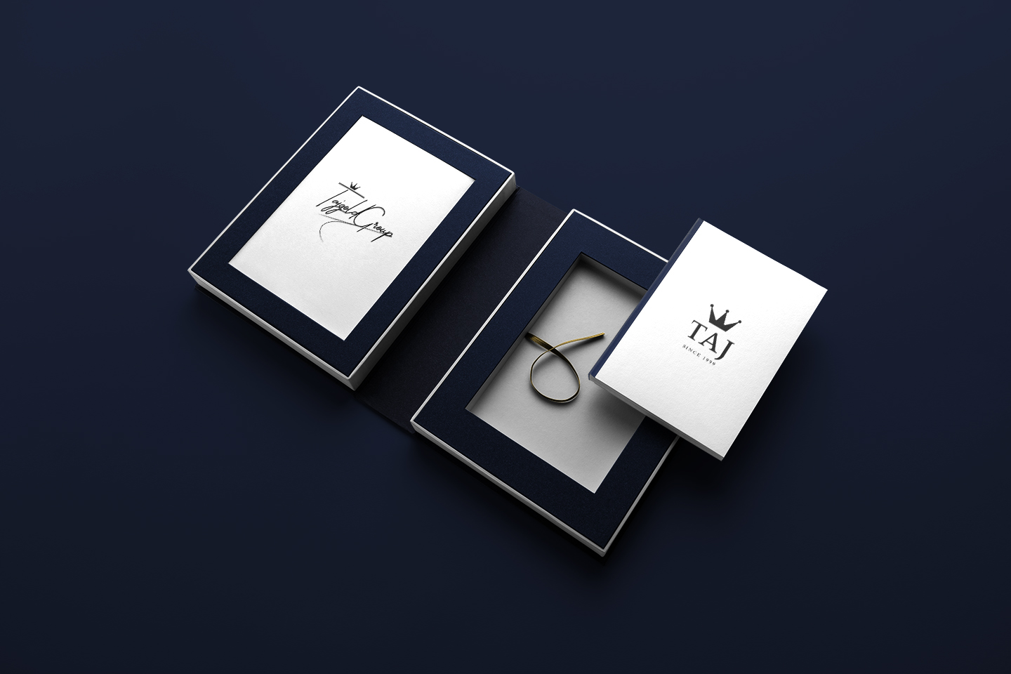
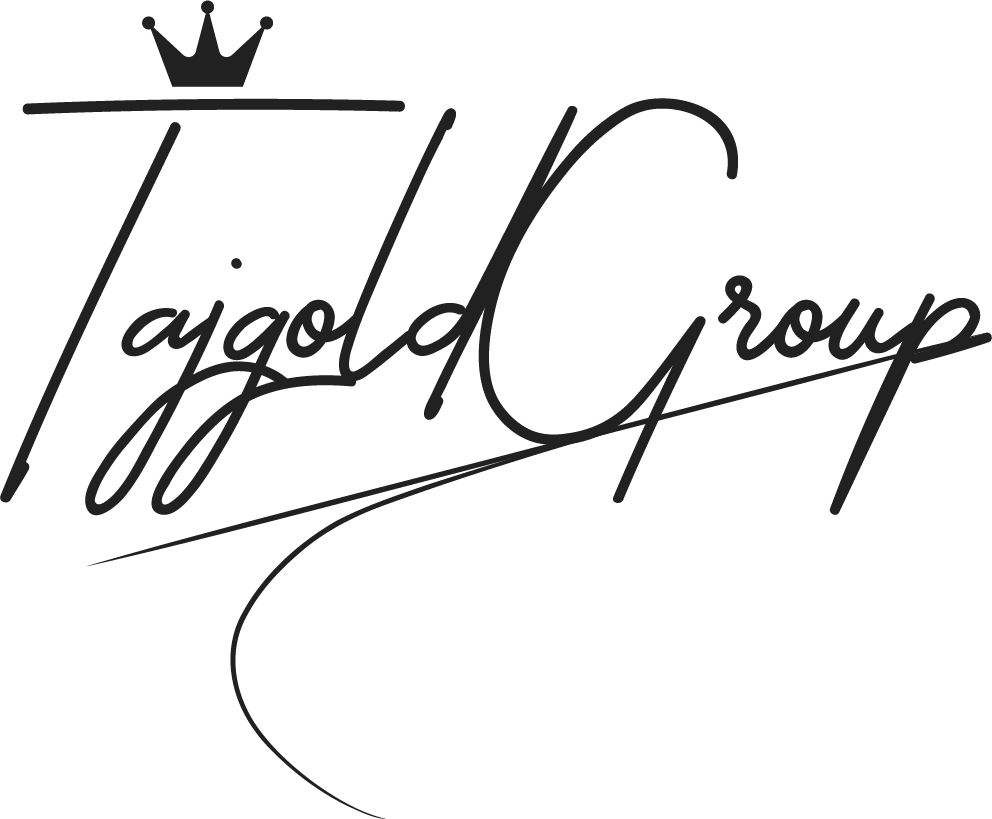
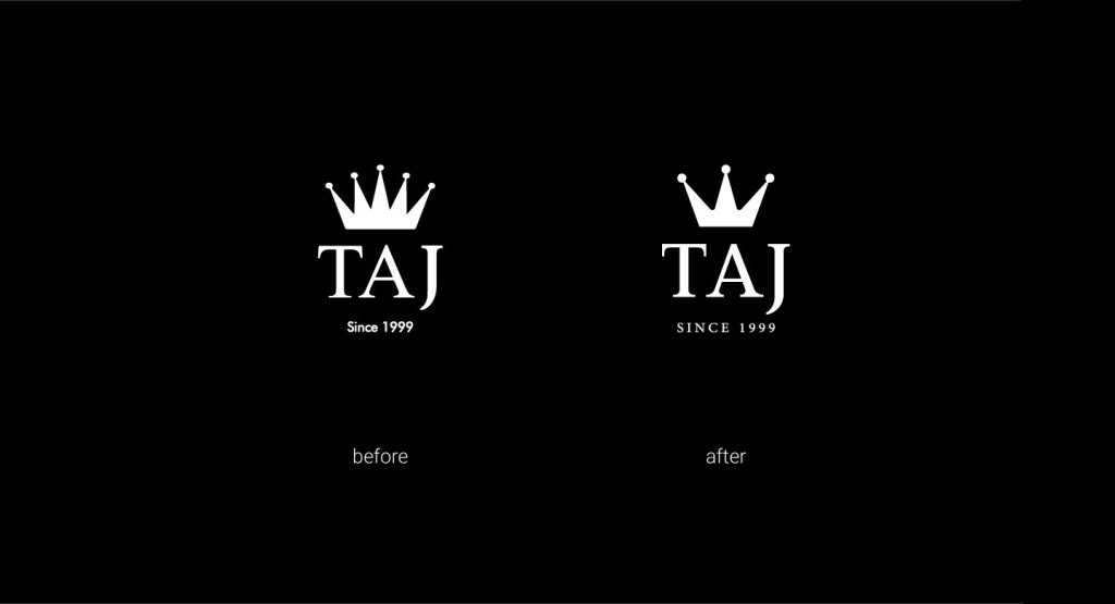
This project is a redesign of the visual identity, considering the history of Taj Gold and the old design of this brand, the need for an update and an identity suitable for the new activity and strategy of the collection was felt. The previous logo was a crown design with 5 branches. In the new logo, the main and clear change is the crown of 5 branches to the crown of 3 branches, which is the main reason for the founders of this company, which consists of three people, then by changing some of the sharper angles to soft angles, a more modern atmosphere has been created, which is on the path of rejuvenation. And a more friendly atmosphere was taken. In this regard, various forms of logos, patterns, advertising formats and other essentials are designed and standardized.





Click to see other

Logo Design

Madeleine Logo Redesign & Package Design When the Madeleine project was entrusted to me, the logo was already designed. This project first came to me for packaging design, but when I saw

KAI Cafe & Restaurant Logo Design KAI Cafe & Restaurant “Nestled in the heart of verdant fields, where the vibrant energy of nature intertwines with the dynamism of activity, KAI Cafe &
tap button and see