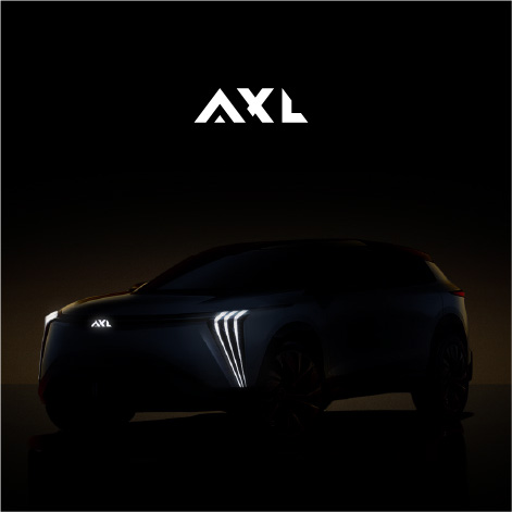
PETTE BEEF
PETTE BEEF Logo Design PETTE BEEF California,USA The project that was entrusted to me by the American employer, with a minimal brief, the required color is white and gold, and a typography
Logo Design
“Nestled in the heart of verdant fields, where the vibrant energy of nature intertwines with the dynamism of activity, KAI Cafe & Restaurant emerges as a sanctuary for ‘togetherness.’ More than just a dining venue, it’s a space that brings to life intimate family gatherings, lively conversations among friends, and even joyous competitions. With a wholesome and innovative menu, featuring fresh, organic dishes and unique beverages, we offer exceptional hospitality to create an engaging and reassuring experience for our guests’ palates and well-being. Our passionate and spirited team is always ready to infuse your gatherings with positive vibes through flexible and sincere service. From cozy corners for romantic chats to large tables for festive celebrations, we’re here to accompany you every moment, coloring your memories with healthy flavors and cheerful moments at KAI Cafe & Restaurant.”
"Brand Identity and Logo Symbolism:
The logo of KAI Cafe & Restaurant is inspired by the concept of ‘the need for two to create collective beauty.’ Two aligned circles symbolize two cups or plates viewed from above, as if two people are seated across from each other, sharing moments of companionship, friendly competition, or intimate conversations. These two simple yet profound circles remind us that life is incomplete without company and sharing. Just as we always need ‘a second’ to enjoy a coffee, play a board game, or share a sweet memory, KAI Cafe & Restaurant provides a space that facilitates this ‘second’ in every possible way, whether it’s an old friend, a family member, or even a stranger with similar tastes.
In the brand’s mood board design, images of people with diverse tastes engaged in conversation, laughter, or competition over a game hold a special place. These images, consistent with the two-circle symbol of the logo, emphasize that KAI is a place for everyone; a place where the healthy and delicious food captivates you so much that you lose track of time. Here, every meal is not just about eating; it’s the beginning of a story that, with the company of another, turns into a cherished memory at KAI Cafe & Restaurant.”
Click to see other
PETTE BEEF Logo Design PETTE BEEF California,USA The project that was entrusted to me by the American employer, with a minimal brief, the required color is white and gold, and a typography
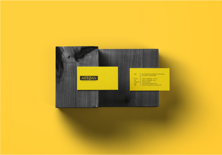
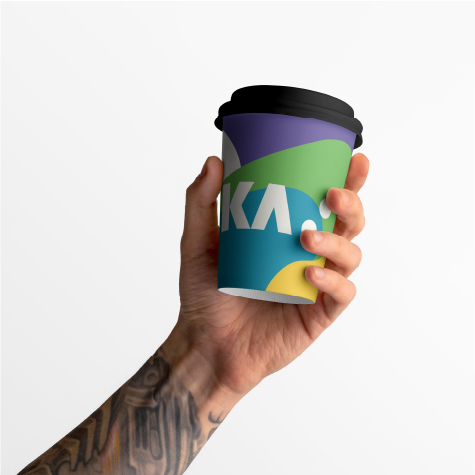
Visual Identity Design
Madeleine Logo Redesign & Package Design When the Madeleine project was entrusted to me, the logo was already designed. This project first came to me for packaging design, but when I saw
tap button and see