TAJ GOLD
Redesign Logo / pattern / Color palette / ads guideline

After five years of operating with its original visual identity, Kellowear had reached a point where its appearance no longer fully supported the brand’s evolving needs. As a women’s sportswear brand built around the idea of doing what makes your heart beat, Kellowear aimed to motivate women and build meaningful connections with its audience.
The challenge was not simply to make the brand look newer. Its visual identity needed to communicate more clearly, work more effectively across apparel and retail applications, and remain true to the personality that defined the brand.
Before developing the visual direction, the brand’s identity, audience, and personality were examined. Kellowear’s Lover archetype provided a foundation for the redesign, emphasizing affection, emotional connection, and a sense of personal attachment.
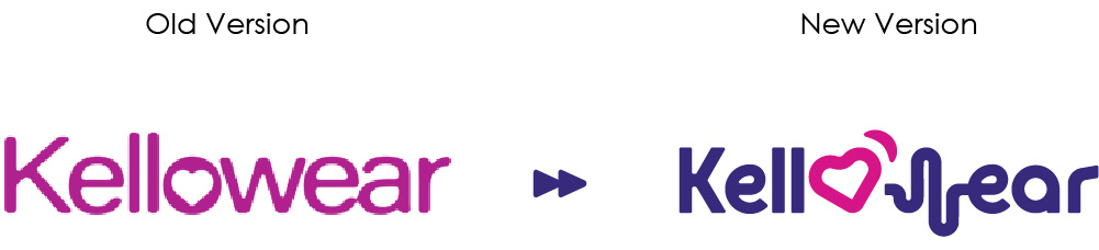
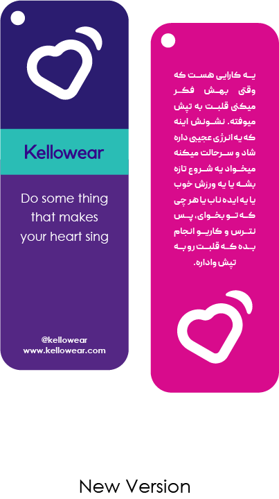
The heart was already central to the brand’s visual language. Its original tilted form suggested a beating heart, supported by a curved detail in the upper-right corner. However, the existing mark had limitations: its thin, sharp lines created practical challenges when reproduced on garments, while its rotation lacked a clear visual rationale.
The redesign began by addressing these issues without abandoning the symbol’s original meaning.
The heart-inspired mark was made bolder to improve legibility and reproduction across different applications, particularly on sportswear. Its angle was also reconsidered to give the rotation a more intentional relationship with the brand’s personality.
The revised form was designed to evoke a subtle human gesture: a head tilted toward someone, listening attentively and responding with warmth. This interpretation connected the heart to something more personal than a symbol of emotion alone. It became a visual expression of Kellowear’s desire to listen to, understand, and connect with its audience.
AXL, a new company that is going to produce electric and economical electric cars, has brought its first car called Sharks 5 to the production stage and participated in several exhibitions in Dubai in 2024 and was very well received. The AXL project started with the redesign of a logo that had already been designed, the previous logo had problems, and with a few changes in the proportions, it reached the right and desired form. After the logo redesign, according to the client’s order, the visual brand identity guidelines were designed based on the brand identity strategy, this order included the following:
Logo redesign along with its architecture and standardization, color palette, font, Sharks 5 exclusive logo design, online and print advertising section, email marketing, initial landing page for product introduction and stationery and image mood board.
For the design of all departments, it was necessary to research competitors and analyze the psychology of the audience in the Middle East and Europe (target audience). Finally, the images you see in the mockup are part of the initial implementation of the project, that’s why some of the images used are not AXL’s exclusive images, and the images of the Mood board proposal that were collected were used.
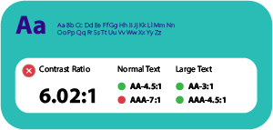
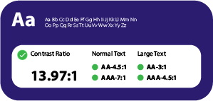
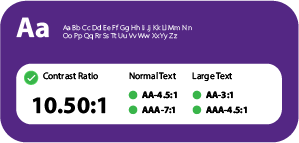
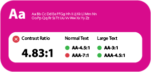
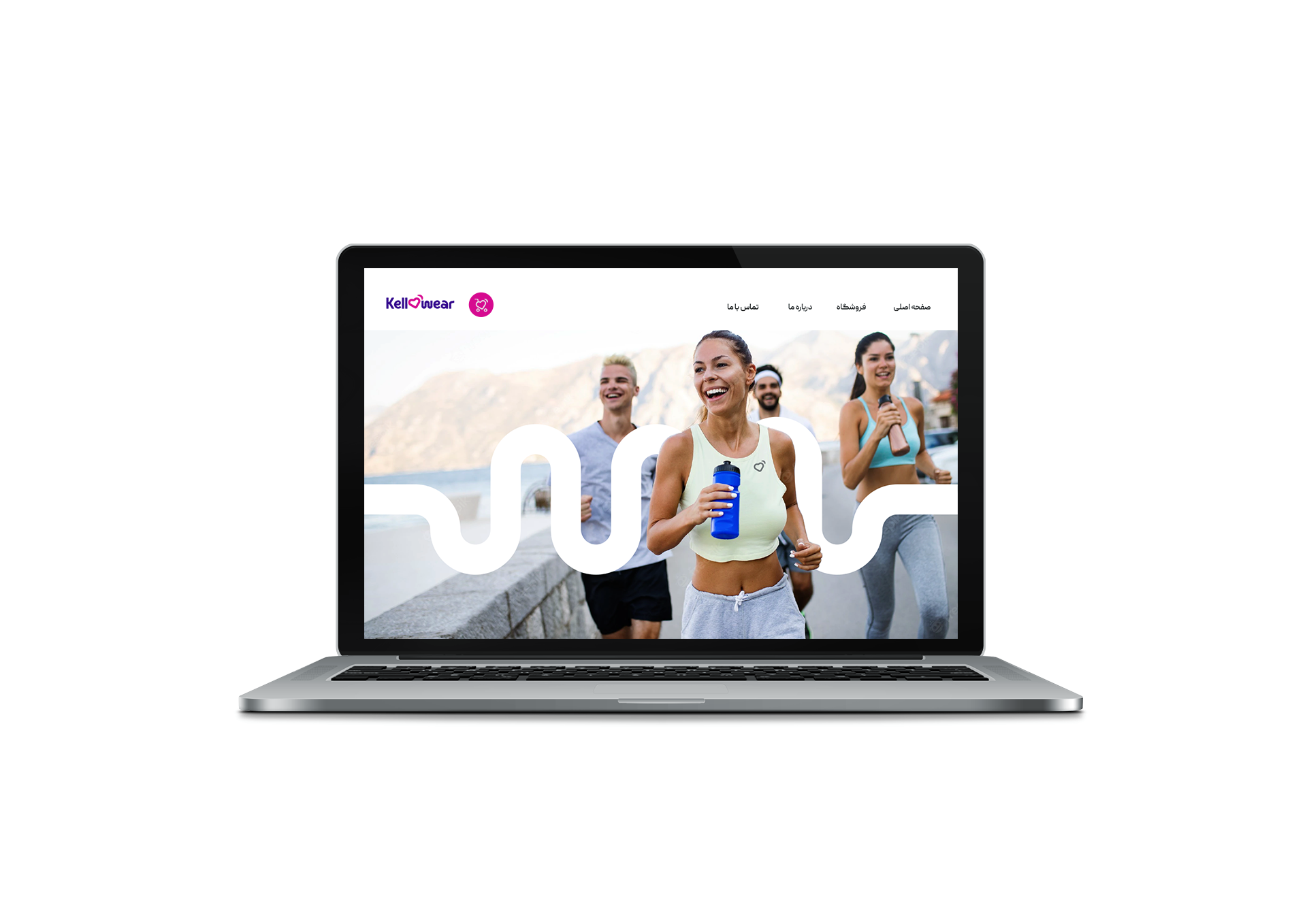
The original colors lacked the clarity and saturation needed to express a brand built around energy and motivation. A new four-color palette was developed with stronger contrast and greater visual impact.
Each color contributed to a broader expression of femininity, strength, boldness, and affection. Together, the colors created a more distinctive and flexible system, allowing the brand to maintain a recognizable presence across different applications.
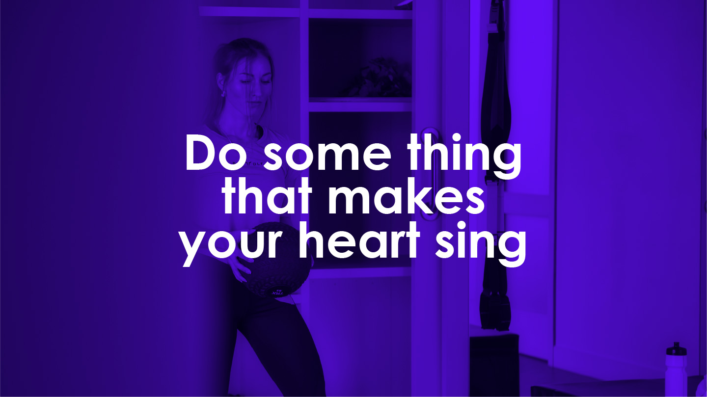
Two years after the identity redesign, Kellowear returned to develop its store interior in line with the established visual system. This extension brought the brand’s identity into a physical environment while considering the practical needs of its female customers.
The store layout considered ease of access to fitting rooms and a greater sense of privacy during product trials. These decisions connected the customer experience to the brand’s audience understanding, making the space functional as well as visually aligned.
A distinctive ceiling treatment became a key visual feature. The Kellowear pattern, shaped to suggest a heartbeat, was integrated with lighting across a magenta ceiling, using one of the brand’s signature colors. This created a memorable spatial expression of the identity without relying solely on the logo.
Kellowear’s redesign demonstrates how brand identity can extend beyond a refreshed mark or a new color palette. By grounding design decisions in the brand’s personality and audience, the visual system created continuity between the products, communications, and retail experience.
This consistency helped establish a more coherent brand presence and supported customer trust and loyalty. The project’s central idea was simple: a visual identity becomes more valuable when its underlying strategy informs every place where people encounter the brand.
Click to see other

Redesign Logo / pattern / Color palette / ads guideline

Madeleine Logo Redesign & Package Design When the Madeleine project was entrusted to me, the logo was already designed. This project first came to me for packaging design, but when I saw

Logo / color palette / Photo mood board / email signature / ads guideline
Intelligent brand systems for businesses ready
to become clearer, more consistent and more distinctive.
Have a brand problem worth solving?
Start a Project
Linked In
Behance
DISCOVER / DEFINE / DESIGN / DEPLOY / DEVELOP
© 2026 Ashkan Siri
|
Brand Strategy – Brand System – Brand Design