A strategic visual identity redesign for Kellowear, refining its heart-inspired symbol, building a more expressive color system, and extending the brand into a cohesive retail experience.
A comprehensive visual identity for Artizan, connecting its diverse tableware collections through a consistent design language across print, digital, and environmental applications.
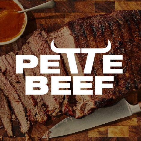
A typographic identity concept combining white and gold with a recognizable beef-inspired symbol, developed for an American client and a meat-focused market.
A hospitality concept built around shared experiences, bringing nature, fresh food, and meaningful social connections together at KAI Cafe & Restaurant.
A visual identity inspired by Sarah’s calm and flexible nature, translating yoga movements into a distinctive symbol supported by clear, personal typography.
A packaging design project that evolved into a broader visual refinement, combining a refined logo, print-ready brand colors, and a custom pattern inspired by Madeleine’s store interior.
A fluid visual identity inspired by the movement of air, the infinity symbol, and the shape of the nose, extended through a custom pattern of soft, flowing forms.
A personality-led identity inspired by founders Sogand and Sadaf, combining vibrant colors, soft forms, and a distinctive initial-based logo to express warmth, friendliness, and positive energy.